
Aspira
Rainger — responsive tables, a platform component
Two years, ongoing
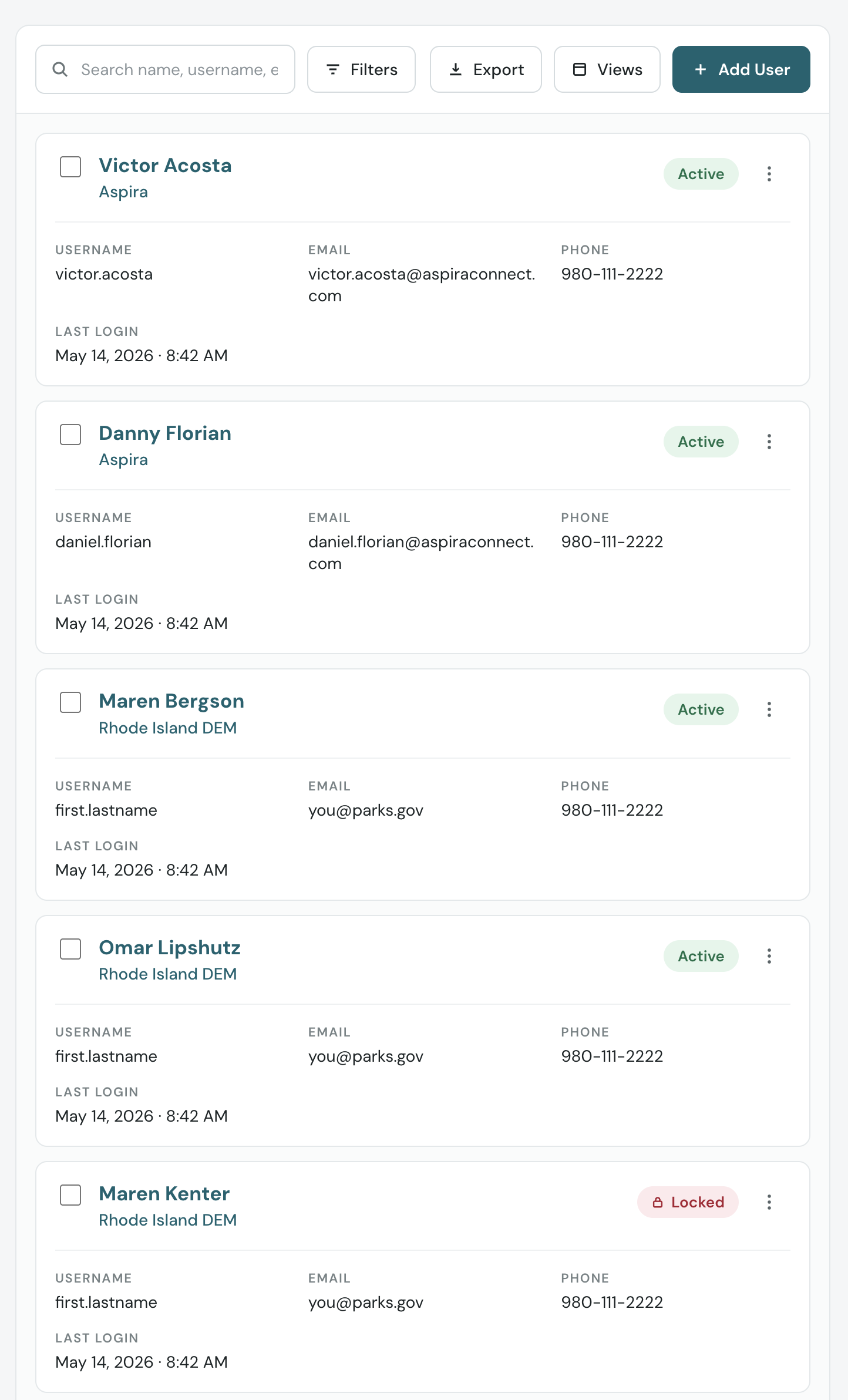
Nine columns of sideways scrolling became one card per record, and whatever you sorted by becomes the heading.
The business problem
Rainger stopped being a desk product. The tables did not notice.
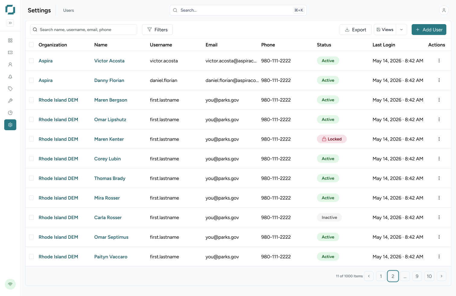
Rainger is the software state agencies use to run public lands — reservations, permits, staff and facilities. The admin surfaces are tables, and the tables are wide: the user list alone carries nine columns and a thousand records paged eleven at a time.
That was fine when Rainger was a desk product. It stopped being one. Business requirements called for a responsive web app, because front desk staff work on tablets and rangers need records while they are out in the park. At some parks, small-screen sessions run around 40% of usage.
The existing responsive behaviour was overflow scrolling. You could get to every column, but only a few at a time, and never the whole record at once — so reading one person meant scrolling right, holding four fields in your head, scrolling back. Pinch-and-zoom was worse: it worked, but it was tedious enough that people stopped doing it. The most consistent feedback was not about task failure. It was that the table was small and people were squinting at it.
The reframe
A column header is stated once and implied a thousand times.
A table does two jobs at once. It is a set of records, and it is a comparison instrument — the grid exists so you can run your eye down a column and compare a value across rows. On a 375px screen you cannot have both, so the question became which job the ranger was actually doing, and the answer was clearly the first one. They were not comparing a thousand users. They were finding one and acting on it. Once the comparison job is off the table, the grid stops paying for itself: a header is only efficient if you can see it and the value at the same time. When you cannot, the label has to travel with the value. So: transpose. Each row becomes a card, and each column header becomes a heading inside the card, stated once per record instead of once per table.
The work
The transposition is not flat. Some fields get promoted.
The rule for which ones is the part I would want another designer to take away from this. The heading is bound to the sort key — not hardcoded to name. Whatever column you are sorted by is the thing you are scanning for, so that value becomes the card’s heading. Sort by email and the email becomes the heading, with name demoted into the labelled pairs below. The card follows your intent instead of assuming it.
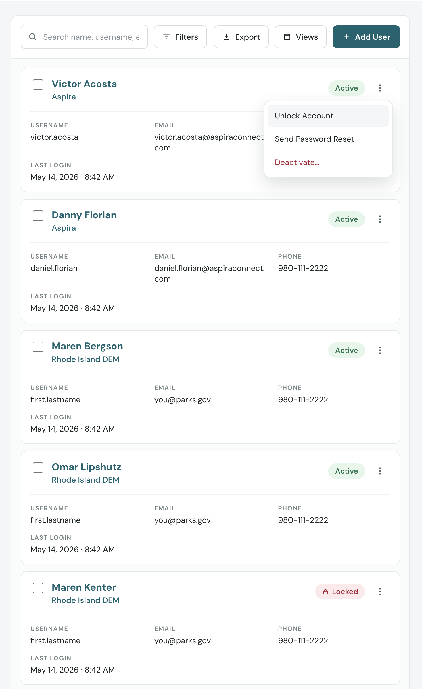
Organization sits under the heading as context, because in a multi-tenant system the same name can exist in more than one agency, and a record without its tenant is ambiguous. Status and actions hold their table positions — badge top-right, overflow menu at the corner — so it is the same reflex in a different container. Everything else becomes a labelled pair in a simple grid, with longer values allowed to wrap onto their own row.
One side effect I did not plan: the desktop table truncates email to fit its column (victor.acosta@aspirac…), and the card does not. The small screen shows more of the record than the large one.
This shipped as a table component used throughout Rainger, not a one-off for the user list. That is what made it matter — it changed what staff could do away from a desk across the whole product, rather than on one screen.
Explorations that died
-
01 / 02
Overflow scrolling, made friendlier
A more considerate version of what was already there — better affordances, clearer scroll cues. Every problem survived the polish: still cramped, still hard to read the columns, still impossible to see a whole record. That is when it became clear the issue was the grid itself, not the grid’s manners.
-
02 / 02
Pinch and zoom
Technically a solution. Rejected because the cost is paid per record, all shift long.
Tradeoffs
What got cut, and why.
- Vertical cost. Five cards occupy roughly the vertical space of eleven table rows. You trade horizontal scrolling for vertical scrolling. That is the right trade on a phone — vertical scroll is the native gesture and horizontal scroll inside a page is not — but it is a trade, not a free win.
- Cross-record comparison is gone. You genuinely cannot scan a column of statuses in the card view. I accepted that because it is not what small-screen users were doing, but it means the card view is not a substitute for the table. It is a different tool for a different posture.
- Bulk actions stay on desktop. Multi-select survives visually, but destructive batch operations on a phone, one-handed, in the field, is a mistake generator. Constraining them to desktop was deliberate.
Impact
No clean before-and-after, and that is the honest version.
I do not have a before-and-after metric on this one. What I have is that small-screen usage was already around 40% at some parks and rising, that the component propagated across the app rather than staying on one screen, and that the feedback was users thanking us for saving their eyes.
That last one sounds soft, but squinting is a real cost paid dozens of times a shift, and it is the kind of friction that quietly determines whether people use the mobile app at all or wait until they are back at a desk.
If I were doing it again I would instrument time-to-locate-a-record by viewport, before and after. That number exists and I did not capture it.
Reflection
The fix was not a layout. It was a rule — the sort key is the heading — and rules survive contact with screens I did not design: any table in Rainger can adopt it without me deciding, per table, which field belongs on top. I would push harder on measurement next time. The component was obviously better and everyone agreed it was obviously better, which is exactly the condition under which nobody bothers to prove it.