
GoodUnited
Natural-language reporting for nonprofit fundraising
Nine weeks
Monthly reporting went from about four hours of spreadsheet work to a paragraph a director could forward in under two minutes.
The business problem
The value was real and completely invisible at renewal time.
GoodUnited sits on top of Facebook Fundraising for some of the largest nonprofits in the world — organisations moving millions of dollars a year through peer-to-peer campaigns. The buyer is a digital fundraising director; the daily user is a campaign manager. Every renewal conversation reduces to one question: what did we get for this?
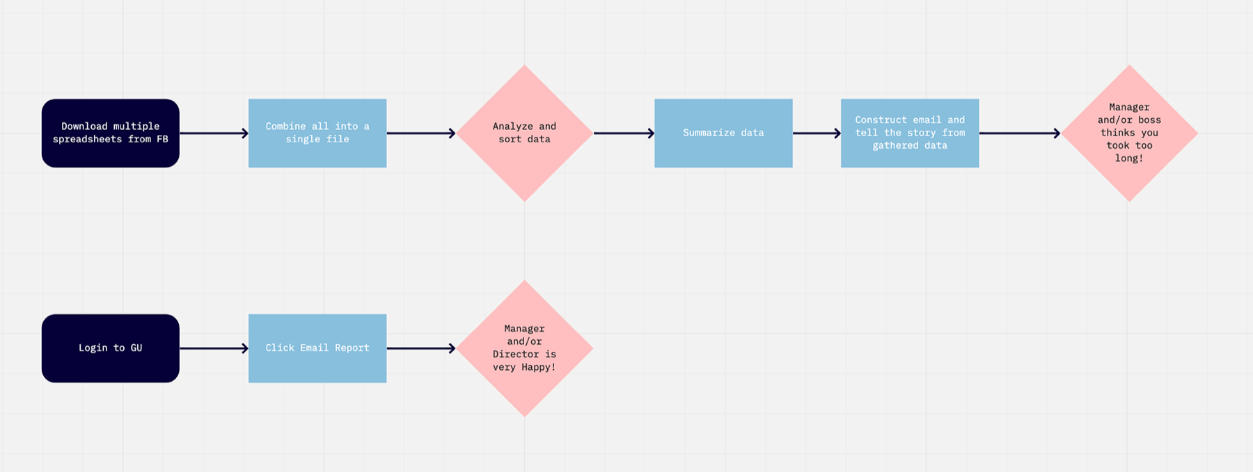
GoodUnited’s answer to that question was a data export. Facebook’s own answer was several CSVs with no shared key. So once a month the campaign manager spent the better part of a day combining spreadsheets, applying filters and formulas, and assembling a deck — a process the user interviews described as confusing, time-consuming, and impossible to compare across periods. Anyone less comfortable in a spreadsheet struggled most.
Two commercial consequences followed. The work product reflected on the campaign manager rather than on GoodUnited, so the platform got no credit for the results it produced. And because assembly was manual and error-prone, the numbers reaching the director were late, inconsistent, and occasionally wrong — at the exact moment the platform’s value most needed to be legible.
The reframe
They weren’t asking for a dashboard. They were asking for a sentence to forward.
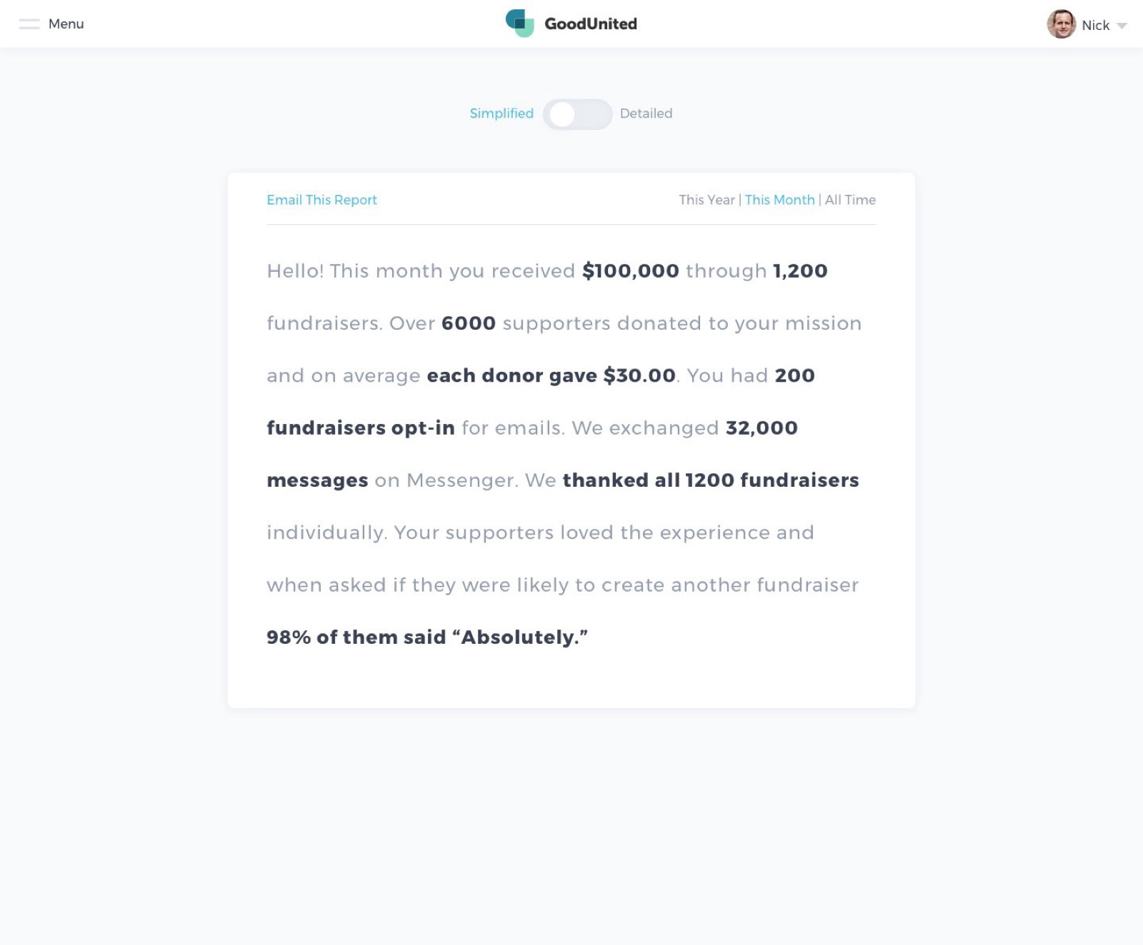
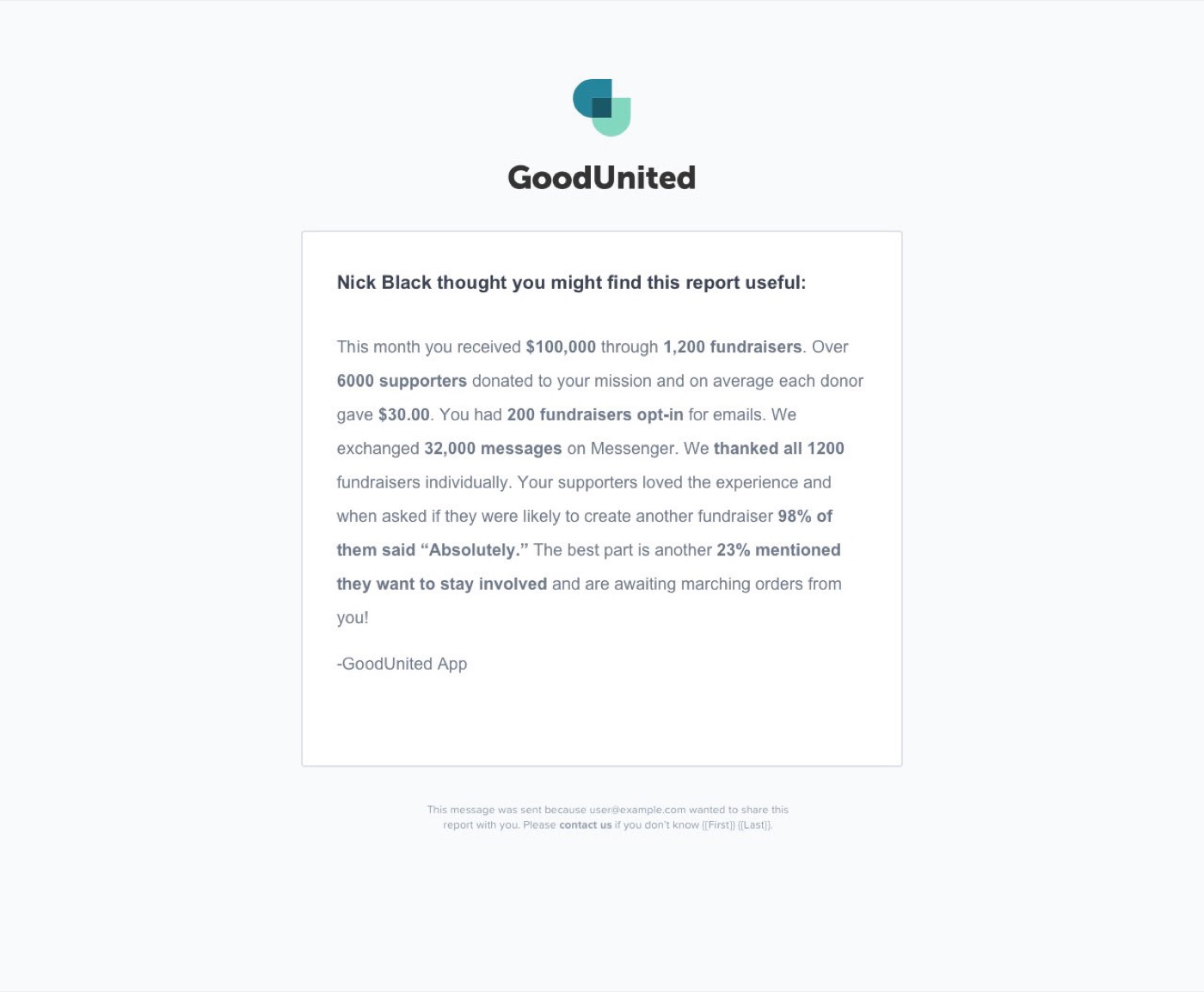
Every user I interviewed described the same end state, and it was never a chart. It was an email to their boss. The dashboard was a step they tolerated on the way to writing that email. So I designed the email first — a paragraph of plain English with the numbers set in bold, written the way a competent human would write it — and let the dashboard become the thing you open only when the paragraph raises a question. Inverting the order changed what the product was for.
The work
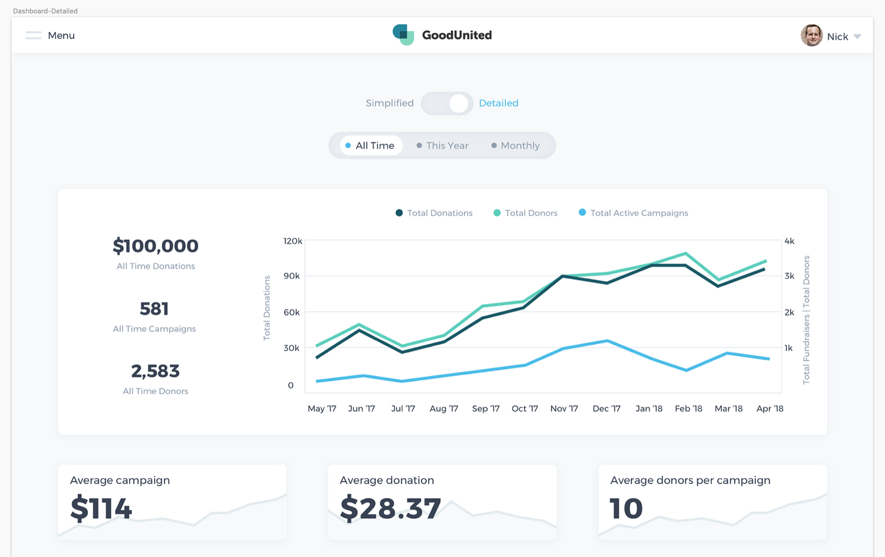
A paragraph you can send, and a table for when you don’t believe it.
Explorations that died
-
01 / 03
A conventional KPI grid
It was every analytics product ever built, and it still left the user to write the sentence themselves — which was the actual work.
-
02 / 03
Auto-generated slide deck
It produced the artifact but not the authorship: directors edited every slide anyway, and PPTX generation was a month of engineering for a format nobody trusted.
-
03 / 03
Chat-style Q&A over the data
Query coverage in 2020 was too narrow to be dependable, and one wrong answer about a donation total is unrecoverable trust damage in this category.
Tradeoffs
What got cut, and why.
- Custom date ranges. Three presets — this month, this year, all time — covered well over 90% of the reporting cadence we observed. Arbitrary ranges made the sentence templates combinatorially harder to keep grammatical, and an ungrammatical sentence is worse than no sentence.
- Multi-campaign comparison. The second-most-requested feature and the obvious next step. It needed a campaign taxonomy that did not exist in the data model yet, and inventing one in the reporting layer would have locked in the wrong shape.
- Actual language generation. Every sentence is a hand-written template with slots, reviewed by the team. Far less flexible than generating prose, and the reason directors forwarded the email unedited: no sentence ever went out that a human had not already approved.
- Personality in the detailed view. It is a plain table-and-chart screen with no visual ambition at all. That was a choice — it exists to be audited, and anything expressive there would compete with the paragraph that does the real work.
Impact
Report assembly fell from about four hours to 96 seconds.
-
~4h → 96s
Median time to assemble a monthly report.
Measured: self-reported duration in pre-launch interviews (n=11, median 3.5–4.5 hours) against instrumented time from login to “Email This Report” post-launch (median 96 seconds).
-
3.1×
Monthly logins per account.
Measured: authenticated sessions per account, 90 days before vs. 90 days after, excluding the launch month to avoid novelty inflation.
-
8 / 10
Largest accounts cited the report at renewal.
Measured: CSM-logged renewal calls in which the emailed summary was screenshared or quoted, across the first two quarters after launch.
Reflection
Designing the email before the dashboard was the entire trick, and I nearly missed it because “analytics product” pattern-matches to “build a dashboard.” The rigid templates were right for trust and wrong for longevity — by year two the team was maintaining dozens of near-identical sentences. I would invest in a template grammar earlier, rather than a template list.