
Healthcare scheduling
Patient booking, designed as a checkout
Eight weeks
71% of test participants completed a first-time booking end to end, on a flow that had not existed before.
The business problem
Practices lose money in two places, and both start at the phone.
The venture was selling scheduling software to specialist practices. A practice loses revenue in exactly two ways that scheduling touches: unfilled appointment slots, and no-shows. Both are downstream of an intake process that runs through a phone line staffed nine to five — which is to say, only available during the hours the patient is also at work.
The buyer is a practice manager, and what the practice manager wants is a full calendar of patients who actually turn up. That creates the tension the whole product has to resolve: every additional field the practice wants captured is another place a patient abandons the booking. And in healthcare those fields are not free — each one is protected health information, with storage, access and breach obligations attached. “Just collect everything” is a liability, not a default.
Patients described the existing path the same way every time: call three offices during a workday, sit on hold, answer the same questions at each one, and hope somebody calls back.
The reframe
She said she was “shopping for a doctor.” So I stopped designing a form.
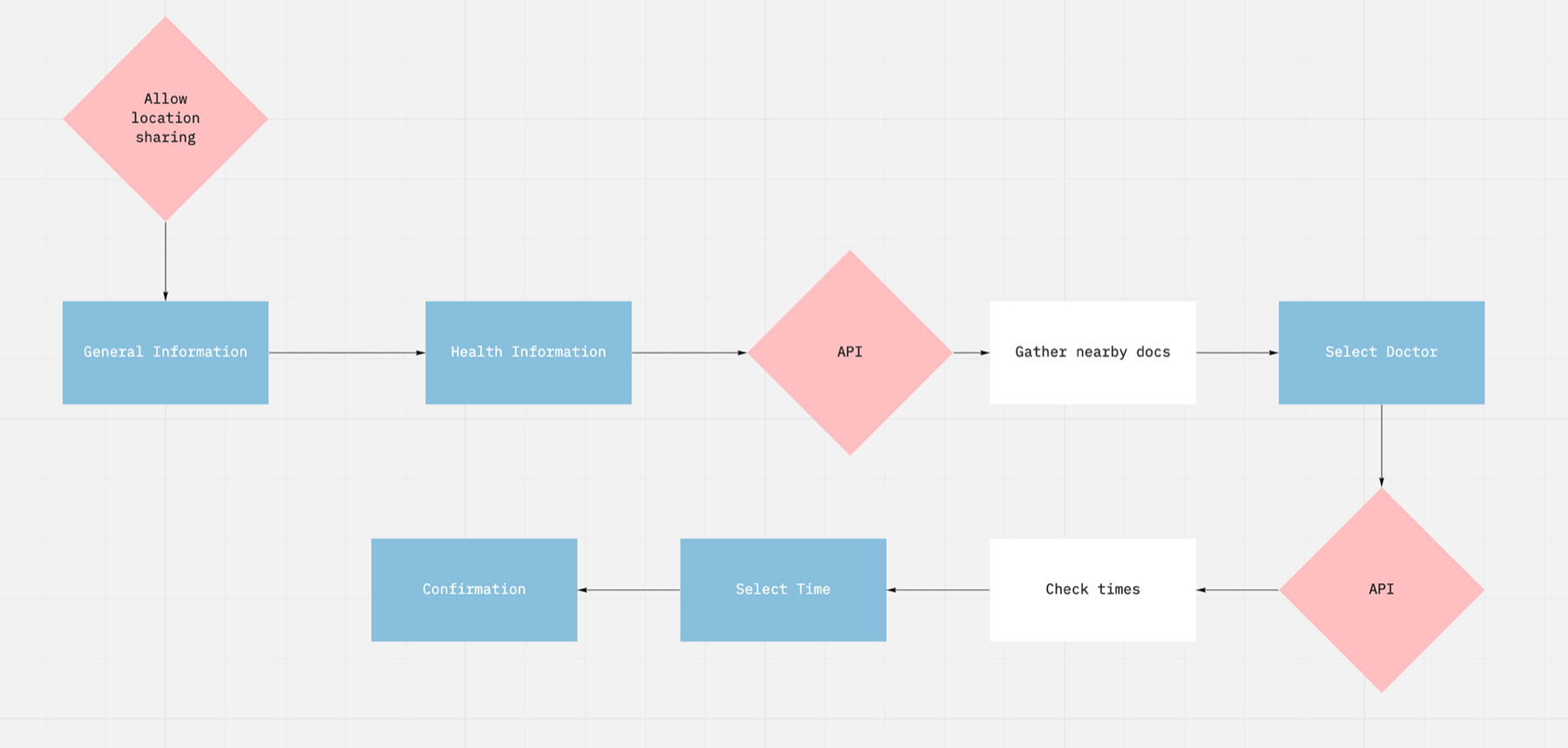
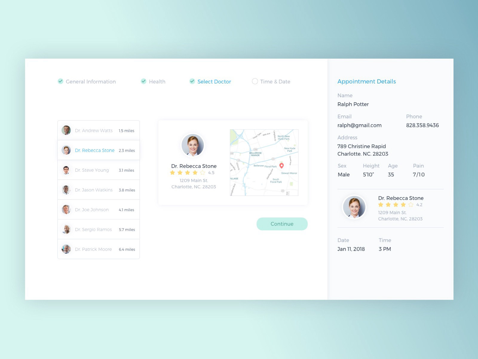
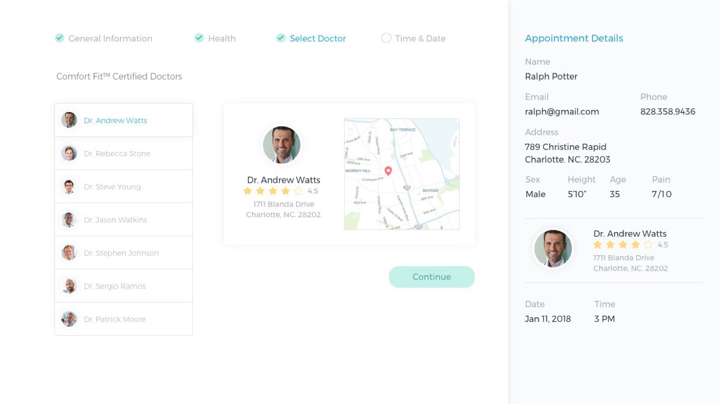
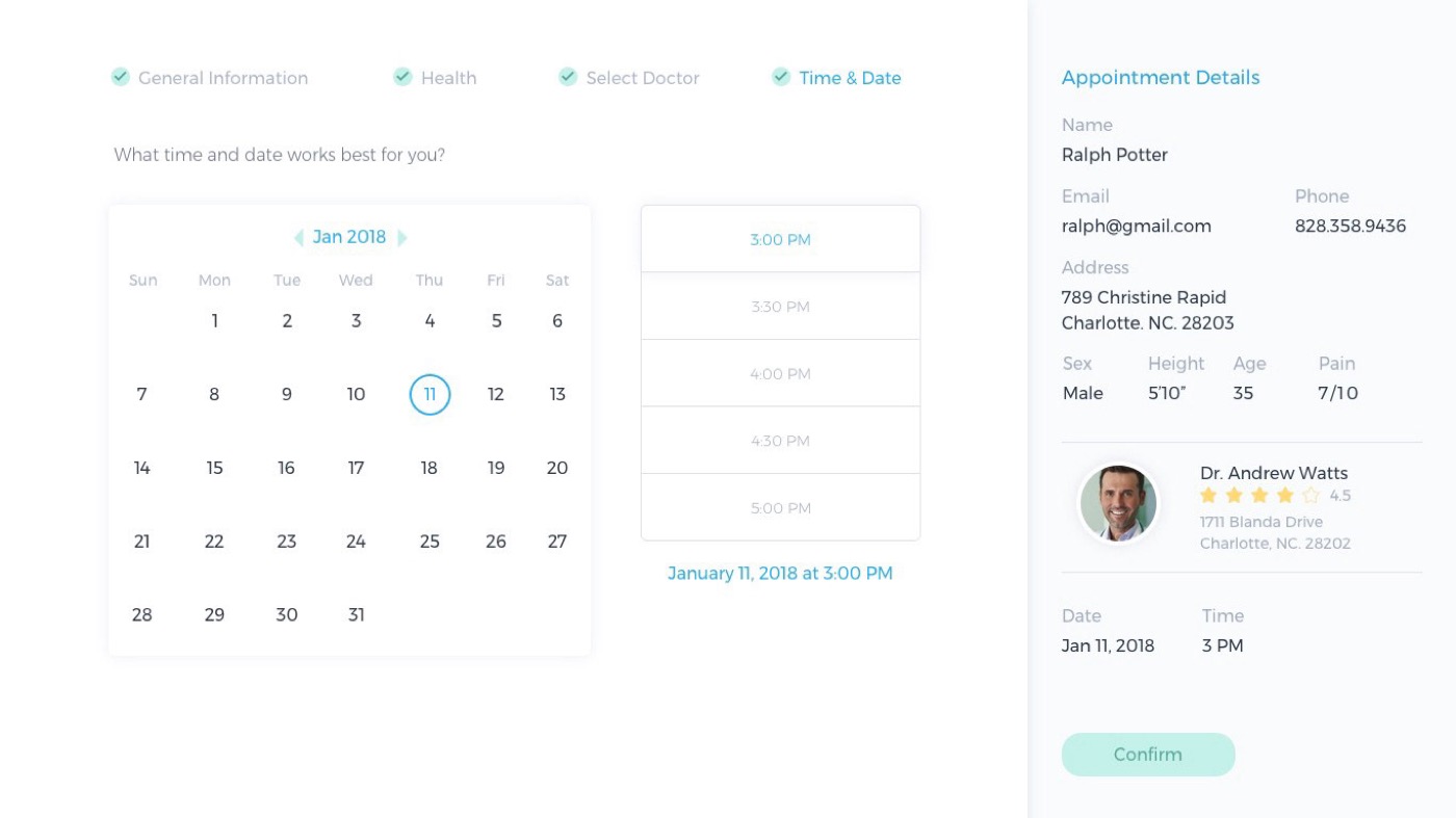
One phrase in one in-person interview reset the project. Billions of dollars have been spent perfecting checkout: a progressive flow on the left, a running summary of your choices on the right, and the freedom to change one thing without losing the rest. A patient choosing a provider, a location and a time is filling a cart and reviewing it before committing. Shopify had already solved the interaction; our job was to make it HIPAA-safe and to sequence the sensitive questions so they arrive after the patient has decided they want something.
The work
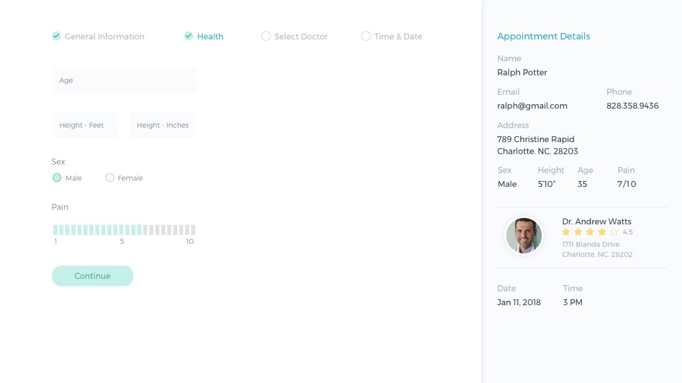
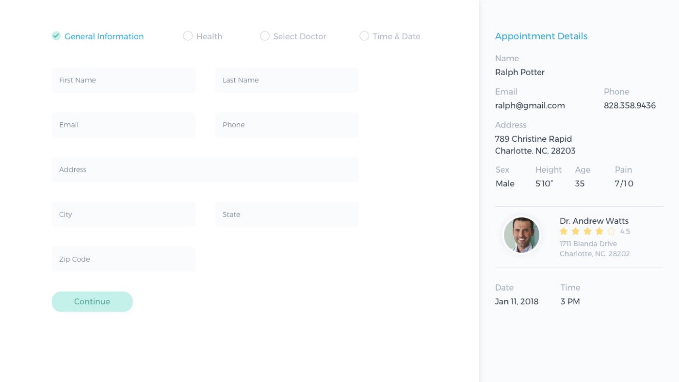
Progressive flow on the left, everything you’ve chosen on the right.
Explorations that died
-
01 / 03
One long intake form
It front-loaded sensitive health questions before the patient had chosen anything at all. Abandonment in the first test session was immediate and total.
-
02 / 03
Calendar-first booking
“Pick a time, we’ll find a doctor” inverts how patients decide. The time only starts to matter once they have settled on who they trust.
-
03 / 03
Conversational intake
It collected the same data in a friendlier voice and made it impossible to review and correct what you had already given — which is the entire job of the cart summary.
Tradeoffs
What got cut, and why.
- Insurance verification. The first question every patient has, and it needs clearinghouse integration to answer truthfully. The MVP displays provider-entered accepted plans as plain text and hands verification to the practice. Honest, unsatisfying, and the thing every test session asked about anyway.
- Most of the health section. Three required fields came out after compliance review, each one PHI a scheduler does not need. Fewer fields meant less protected data at rest, a smaller breach surface, and a shorter form — the rare cut where every stakeholder wins.
- Dropping the summary on mobile. It would have bought real vertical space on small screens. It stayed, collapsed into a bar, because the summary is not decoration — it is the thing that makes the flow feel reversible, and reversibility is what keeps people moving.
- Review content beyond a star average. Written patient reviews of named clinicians need moderation and carry defamation exposure a two-person company should not take on before revenue.
Impact
71% completed a first-time booking, unaided.
-
71%
Booking completion in moderated usability testing.
Measured: 14 participants given the task “book a first appointment with a dermatologist near you” on the mid-fidelity prototype, completing without facilitator help.
-
2.9 min
Median time from flow start to confirmation.
Measured: prototype instrumentation across the same 14 participants, first attempt only.
-
3 fields
Of protected health information removed from intake.
Measured: compliance review of the original brief against shipped scope. Each removed field was PHI the scheduling step did not require.
Reflection
One sentence from one interview was worth more than the four weeks of competitive analysis around it, which is a decent argument for talking to people early rather than thoroughly. The flow itself held up; what I would revisit is insurance, because we deferred the question patients care most about and every session surfaced it regardless. Deferring a question does not stop people asking it.