Overview
GoodUnited helps analyze Facebook Fundraising for non-profits. My role as the product designer was to create an intuitive user flow that simplified the cumbersome process of FB data export and analysis.
Understanding The Problem
I interviewed users to find common tasks, pain points in how they currently achieve their goals and what was most important to them. The common themes I found were:
- Reports are very time consuming
- Managers/Directors want a summary with key metrics and not specific details
- Analyzing all the data across multiple FB spreadsheet downloads is confusing
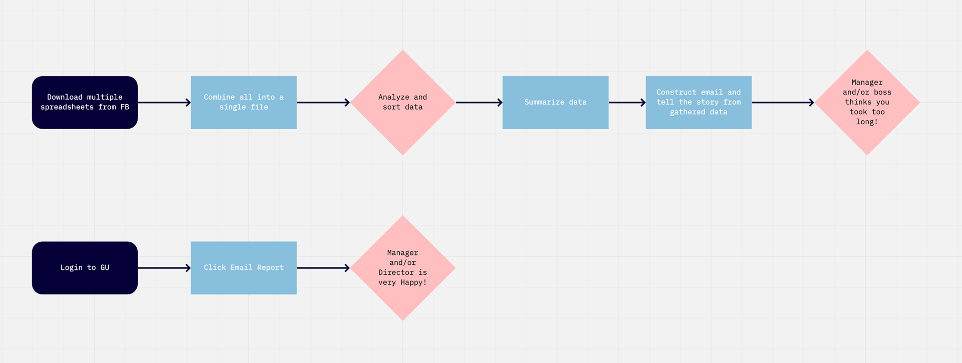
Users found the current process confusing and overly complex. Users with less spreadsheet software experience had the most difficult time combining files. Summarizing the data was another challenge users pointed outed. Comparing numbers from previous timeframes proved to be near impossible.
Users wanted an easy way to compile the data from multiple spreadsheets and then quickly be able to tell the story. On top of that, they want the most important metrics to stand out.
Ideation
Pencil sketching is a quick way to iterate on multiple ideas. I didn't want this to feel like every dashboard in the world. I looked at various analytics platforms and they all shared a common theme. The biggest problem to solve for was the compiling of all key metrics and telling a story.
The solution I came up with, was a simplified dashboard where I used "natural language" to tell the story. I created a simple prototype where I allowed the user to toggle between the two.
The response was overwhelming! Users could not wait to have this in their hands! The flow diagram above shows a high-level overview of the steps required to create a monthly or quarterly report. The process is prone to human error when combining multiple spreadsheets and applying filters and formulas.
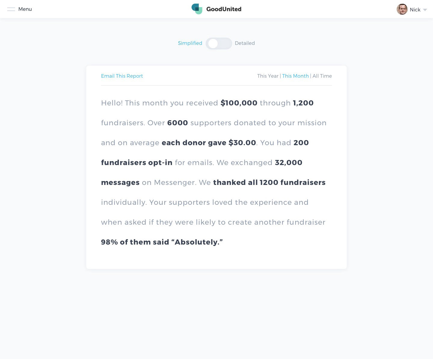
natural language summary of data
This natural language summary allowed the user to simply login and know right away how things are tracking. The summary can also be emailed directly to their manager or director. The user can also toggle between "Simplified" and "Detailed" views if they need to dive into the data.
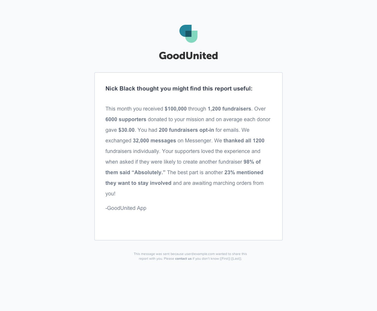
I worked closely with the engineering team to construct the various language templates and required metrics to build the simplified summary.
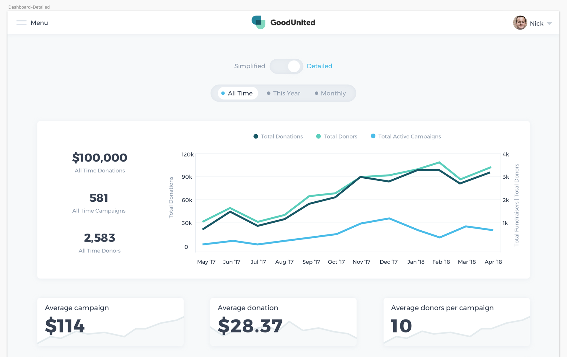
traditional analytics with more detail
Summary 🎉
The product was a HUGE success. Some of the world's largest non-profit organizations use the platform now and with millions of dollars at stake, reporting from Facebook Fundraising has never been easier. In the end, we helped make our users look and feel like rockstars!